
The Psychology of Color in Signage

Colors aren’t just decoration—they’re powerful tools that shape how people see your brand. The right color choices in your signage can influence emotions, drive decisions, and leave a lasting impression.

Best Colors for Different Industries
Each color sets a tone: Blue builds trust (finance, healthcare), Red creates urgency (retail, food), Green signals balance (wellness, eco), and Black/White suggest sophistication (luxury, fashion). Choose what speaks to your audience.
The Impact of Color Contrast
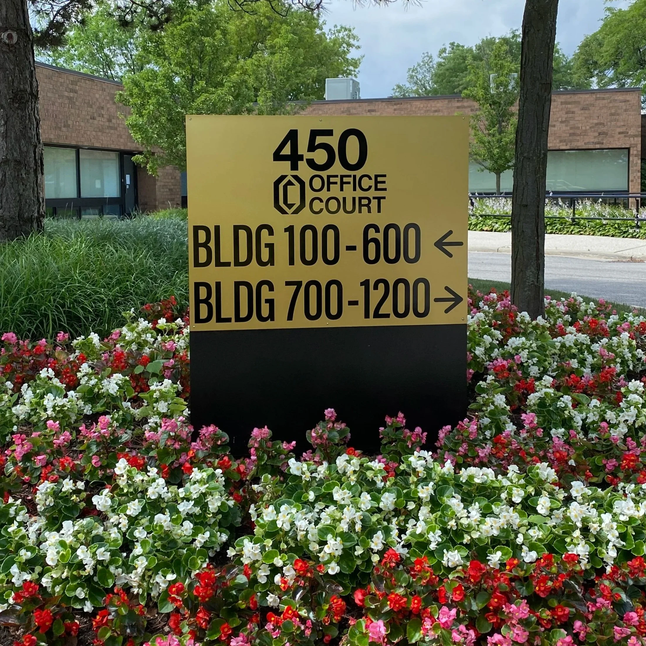
A sign can only do its job if people can read it. High contrast between background and text boosts legibility and grabs attention—think black on yellow, or white on blue. Poor contrast blends into the background and risks your message being missed.
Blue
Reliability, trust, and professionalism.
Popular in finance, healthcare, and tech.
RED
Energy, passion, and urgency.
Commonly used in retail and restaurants to grab attention.
GREEN
Growth, balance, and eco-friendliness.
Ideal for landscaping, wellness, and organic brands.
YELLOW
Optimism and warmth.
Great for hospitality and entertainment.
BLACK & WHITE
Sophistication and timelessness.
Often used in luxury and fashion.

Aligning Colors with Your Brand Identity
Your color scheme should mirror your brand personality. Consistency makes your signage instantly recognizable.

Emotional Triggers of Color
Colors influence how people feel. Warm shades (reds, oranges) excite and energize, while cool tones (blues, greens) calm and reassure. Understanding these emotional cues helps guide customer decisions.
Final Verdict
The colors you choose for your signage aren’t just about looks—they’re about psychology. By aligning your palette with your industry, ensuring strong readability, and staying true to your brand identity, you’ll design signs that speak before a single word is read.
Signs with the right palette don’t just get noticed; they inspire action.