Good First Impressions Start Here
Banner Design Ideas for Your Business
Have you ever met someone you just *did not* particularly like? They made a joke that didn’t sit well, or gossiped about someone behind their back.
First impressions are everything, and they can be hard to shake. And that truth isn’t limited to people: The first impression of your business can make or break it. Whether you’re attracting new customers, launching a product, or promoting an event, how you present your message makes all the difference.
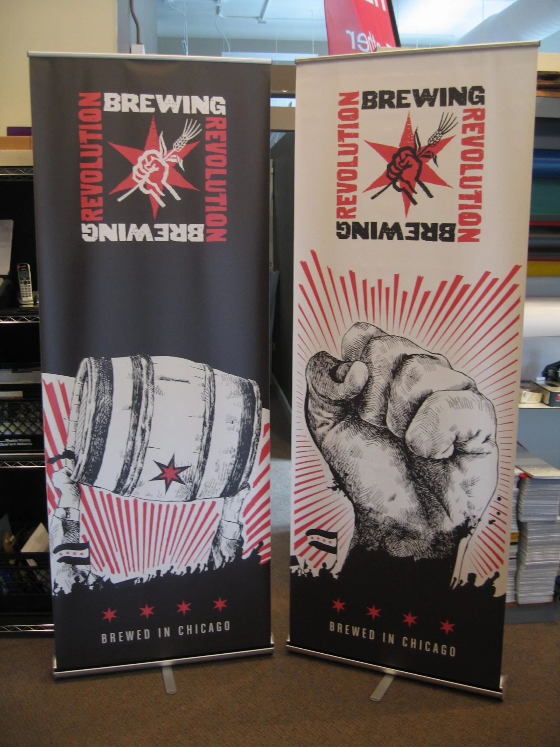
Ready to make a splash with your latest offering or innovation? Do it in style, with a well-designed banner.
Why a banner?
Signs and banners are often the first thing people notice about your business. They can excite and inspire, enticing customers into your store or prompting them to finally make that purchase.
But before you dive straight into production, take a moment to ensure you're getting the most bang for your banner buck.
1.Define Your Goals
What do you want your sign or banner to achieve? Is your goal to attract foot traffic, advertise a special promotion, or increase ticket sales to an event?
Choose one, clear objective and make sure every decision moves you toward that goal.
2.Speak to Your Audience
Next, consider your audience. Who are you trying to reach, and what will resonate with them? Selling concert tickets to a 20-something-year-old is very different from selling to a retiree. Keep your ideal customer in mind, then tailor your design and message to that person.
3.Clarity Trumps Cute, Always
Whatever message you’re communicating, make sure it’s clear and straightforward. Are you celebrating a grand opening? Great! Communicate that one message, instead of muddling it with other side quests of information.
Remember, less is often more when it comes to words (and design!).
4.Consistency is Key
Any message you put out into the world should be an extension of your brand—banners and signs included. Your logo and brand colors should be instantly recognizable, but that only happens when you’re consistent across the board.
Consistency builds trust and familiarity with your audience, making them more likely to engage with your business in the future.
5.Use Quality Visuals
High-quality banners deserve high-quality photos, graphics, and logos. Ask an expert at Signs by Tomorrow if you’re unsure how an image will transfer to a banner. We’re anti-blurry photos, and we’re here to make sure they don’t make it on your banner!
Pro tip: Keep your audience and goal in mind when choosing a color palette. Bright, bold colors can grab attention, while more subdued tones can convey sophistication and trustworthiness.
6.Include a Call to Action
Don’t forget to tell your audience exactly what to do. Whether you want people to visit your website, enter your store, or sign up for a newsletter, make sure to include a CTA: "Get Tickets," "Save the Date," or "Shop the Sale" inspire action.


